What Makes Great Storefront Signage?
Summary: Your storefront sign is more than just a label, it’s a powerful marketing tool that attracts attention, communicates your brand, and influences customer decisions. Effective signage combines clear messaging, readable fonts, eye-catching visuals, and strategic placement to stand out in a crowded marketplace. Avoiding common mistakes, such as overcrowding the design, poor visibility, and inconsistent branding, ensures your sign strengthens your business’s credibility and recognition. By focusing on thoughtful design and quality materials, you can turn your storefront sign into an effective salesperson that drives traffic and increases sales. For expert design and installation, Divine Signs and Graphics can help your business create signage that truly makes an impact.
First impressions matter and for businesses, your storefront sign often speaks before you do. Effective signage is more than just a marker with your name on it, it is a powerful marketing tool that can attract foot traffic, communicate your brand identity, and influence buying decisions in seconds. A well-designed sign can set you apart from competitors on a crowded street, while a poor one might cause potential customers to walk right by.
In this guide, we’ll explore what goes into creating storefront signage that not only catches the eye but also leaves a lasting impression. From design and visibility to messaging and placement, you’ll learn the key elements that transform a simple sign into a powerful business asset.
The Role of Storefront Signage in Business Success
Your storefront sign is more than just a label; it’s your first opportunity to make an impression on potential customers. Studies show that people often decide whether to enter a store within seconds of seeing it, and your signage plays a key role in that decision.
A strong, well-designed sign does four important things:
1. Attracts Attention: In a busy street or shopping center, a sign that stands out can be the difference between a passerby noticing your business or walking past it entirely.
2. Builds Brand Recognition: Your sign communicates your brand’s personality, whether it’s sleek and modern, cozy and welcoming, or bold and energetic. Consistent colors, fonts, and logos help customers remember you.
3. Establishes Credibility: A professional, high-quality sign signals that your business is trustworthy and takes its operations seriously, while a poorly designed or outdated sign can unintentionally drive customers away.
4. Increases Sales: By drawing in more visitors and reinforcing a positive brand image, effective signage directly contributes to higher foot traffic and, ultimately, more sales.
In short, your signage is a silent salesperson, working 24/7 to attract, inform, and reassure potential customers before they even step through your door. Understanding its role is the first step toward creating signage that truly works for your business.

How to Create Effective Storefront Signage
Designing storefront signage that truly works requires a careful balance of aesthetics, messaging, and practical considerations. A great sign doesn’t just identify your business, it attracts attention, communicates your brand personality, and guides potential customers to take action. The following steps break down how to create signage that stands out in a crowded marketplace and delivers real results.
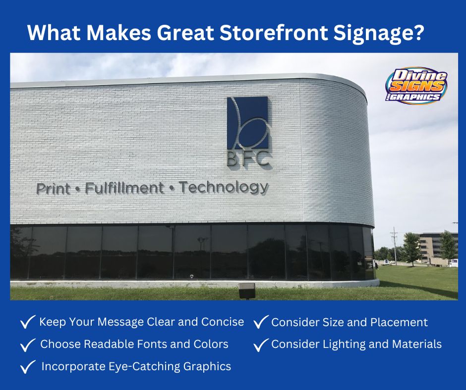
Keep Your Message Clear and Concise
A storefront sign has just a few seconds to make an impression, so simplicity is key. Focus on the essentials: your business name, logo, and perhaps a brief tagline that communicates what you offer. Avoid long sentences or excessive details that can overwhelm viewers. The clearer your message, the easier it is for potential customers to understand who you are and what you do, even from a distance.
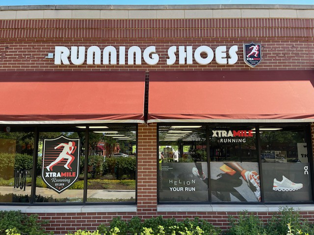
Choose Readable Fonts and Colors
Legibility can make or break a sign. Select fonts that are easy to read from several feet away, avoiding overly decorative styles that slow comprehension. Pair your text with high-contrast colors to ensure it stands out against the background. Consider how your sign will appear in different lighting conditions including daylight, nighttime, and artificial lighting so your message remains visible at all times.
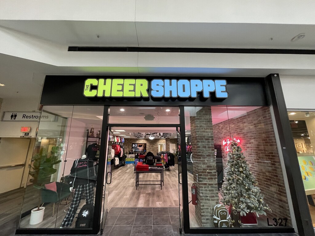
Incorporate Eye-Catching Graphics or Logos
Strong visuals can make your sign memorable, helping your business stick in the minds of passersby. A well-designed logo, distinctive icon, or creative shape can set your sign apart from competitors. However, it’s important to balance visual appeal with clarity, too many graphics or overly complex designs can distract from your message rather than enhance it.
Consider Size and Placement
The right size and strategic placement are critical to ensuring your sign gets noticed. It should be large enough to be read from key vantage points, such as nearby streets or sidewalks, but proportional to your storefront so it doesn’t overwhelm the façade. Placement at eye level or slightly above maximizes visibility, while considering local regulations or zoning laws ensures compliance.
Ensure Consistency with Your Brand
Your signage should reflect your business’s overall brand identity. This includes colors, fonts, tone, and imagery that align with your logo, website, and other marketing materials. Consistency builds recognition and fosters trust with customers, making it more likely they will remember your business and feel confident engaging with it.
Consider Lighting and Materials
The materials and lighting of your sign play a significant role in its effectiveness and longevity. Durable materials like metal, acrylic, or weather-resistant plastics can withstand harsh conditions, while strategically placed lighting, whether backlit, halo-lit, or spotlit, can make your sign visible at night and enhance its appeal. Consider your location, budget, and expected foot traffic when choosing these elements to ensure your sign remains a strong marketing tool for years to come.

Common Mistakes to Avoid in Storefront Signage
Even the best intentions can fall short if your storefront signage makes avoidable errors. A poorly executed sign can confuse potential customers, dilute your brand, or even drive people away. Understanding common mistakes and how to prevent them can save time, money, and missed opportunities.
1. Overcrowding the Design:
One of the most frequent signage mistakes is including too much information. Cramming in long descriptions, multiple fonts, or excessive graphics can overwhelm viewers, making it hard for them to grasp your message. Stick to essential elements including your business name, logo, and a simple tagline to ensure clarity and impact.
2. Neglecting Visibility and Readability:
Even a beautifully designed sign is useless if no one can read it. Signs that are too small, use low-contrast colors, or feature hard-to-read fonts can go unnoticed. Always consider distance, viewing angles, and lighting conditions to make sure your signage is easily legible from the street or sidewalk.
3. Inconsistent Branding:
A sign that doesn’t match your other branding materials can confuse customers and weaken your overall brand image. Using mismatched colors, fonts, or design styles may make your business appear disorganized or unprofessional. Ensure your signage aligns with your logo, website, and marketing campaigns for a cohesive look.
4. Ignoring Local Regulations:
Many areas have strict rules regarding sign size, placement, and lighting. Failing to follow these regulations can result in fines or the need to replace your sign entirely. Check local zoning laws, permits, and guidelines before finalizing your design to avoid costly mistakes.
5. Choosing Poor Materials or Lighting:
Signs that fade quickly, deteriorate in bad weather, or aren’t visible at night fail to serve their purpose. Invest in durable materials and appropriate lighting that can withstand environmental conditions while keeping your sign attractive and readable. The initial investment pays off in long-term visibility and effectiveness.
By avoiding these common pitfalls, you can ensure your storefront signage works as a powerful marketing tool rather than a liability. The right sign not only captures attention but also communicates professionalism, builds trust, and drives customers through your door.
Make Your Storefront Signage Work for You
Your storefront sign is more than just decoration, it’s a 24/7 marketing tool that attracts attention, communicates your brand, and drives customer engagement. By focusing on clarity, readability, brand consistency, and thoughtful design, you can turn a simple sign into a powerful asset that boosts recognition, credibility, and sales.
Creating effective signage may seem overwhelming, but with the right guidance, it can be a straightforward process that delivers lasting results. Our experts at Divine Signs and Graphics can help businesses like yours by designing and installing storefront signs that stand out, make an impact, and bring more customers through your door.
Don’t let your business blend into the background. Contact Divine Signs and Graphics today to create a storefront sign that truly reflects your brand and helps your business shine.
FAQs About Great Storefront Signage
Q: What makes a good storefront sign?
A good storefront sign is clear, visible, and aligned with your brand identity. It uses easy-to-read fonts, high-contrast colors, and strategic lighting to grab attention while communicating your business name or message quickly.
Q: How important is storefront signage for a business?
Storefront signage is often the first impression potential customers have of your business. It not only attracts foot traffic but also reinforces brand recognition, builds trust, and helps you stand out from competitors.
Q: What type of signage works best for storefronts?
Popular options include channel letters, dimensional lettering, illuminated signs, window graphics, and monument signs. The best type depends on your location, local regulations, and how much visibility you want day and night.
Q: What colors work best for storefront signs?
High-contrast colors like white on dark backgrounds or bold colors like red, blue, or yellow work well. The right color choice should also reflect your brand identity and be visible from a distance.
Q: How big should a storefront sign be?
A sign should be large enough to be readable from the average viewing distance of passing cars or pedestrians. As a rule of thumb, each inch of letter height provides about 10 feet of readability distance.
Q: Should storefront signs be illuminated?
Yes, illuminated signs increase visibility at night and during poor weather, ensuring your business is seen 24/7. Options include LED channel letters, backlit panels, or spotlighting.
✅ Ready to Elevate Your Storefront?
Make your first impression unforgettable with custom storefront signage by Divine Signs. Our team designs, fabricates, and installs eye-catching signs tailored to your brand.
📞 Call us today 847-534-9220 to start your project!
Let Us Get Started with your next big idea...
